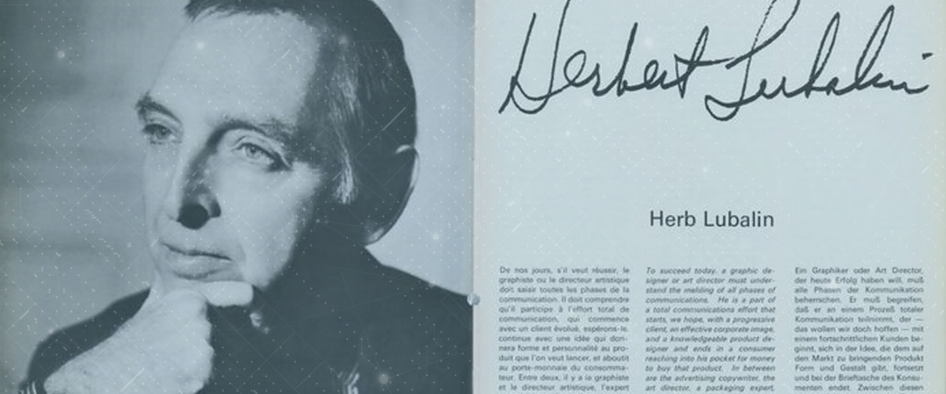
Herb Lubalin stands as a titan in the world of graphic design, leaving an indelible mark on the field of typography. His groundbreaking work in lettering and art direction has shaped the visual landscape of the 20th century. Lubalin’s innovative approach to design has influenced generations of typography graphic designers, earning him a place among the most famous typography artists of all time.
Throughout his career, Lubalin made significant contributions to magazine design, logo creation, and typeface development. His work on publications like Fact Magazine showcased his ability to merge form and function seamlessly. Lubalin’s logos, including the iconic Herb Lubalin logos, continue to inspire designers today. Furthermore, his collaboration on the Avant Garde typeface has had a lasting impact on graphic design, solidifying his reputation as a visionary in the field.
Lubalin’s Design Philosophy
Typography as a Means of Expression
Herb Lubalin revolutionised the field of graphic design by introducing a concept he called “graphic expressionism.” This approach involved using typography or lettering as a creative tool to express ideas and evoke emotional responses from viewers, rather than simply arranging letters on a page. Lubalin believed that typography could be more than just a mechanism for assembling text; it could be a powerful means of communication in its own right.
His innovative perspective led to a significant shift in how designers approached typography. Lubalin’s work demonstrated that letters could become images, reminiscent of early pictographic writings. However, unlike traditional pictographs, Lubalin’s designs used entire words to form drawings, not just individual signs. This approach allowed him to create graphics composed entirely of text that were as visually striking and engaging as images.
Blending Form and Function
Lubalin’s design philosophy centred on the idea that typography should not only be functional but also visually compelling. He understood the importance of combining art, copy, and typography to add conviction when communicating messages. As Lubalin himself stated, “The better people communicate, the greater will be the need for better typography-expressive typography” [2].
His meticulous attention to detail was evident in his work. For instance, in a trade advertisement for Sudler & Hennessey titled “Let’s talk type,” Lubalin precisely placed a single paragraph of text. The copy sat perfectly on the baseline alongside the word “let,” with its size and leading carefully adjusted to allow for the descender from the letter “y” above. This level of precision exemplified Lubalin’s commitment to blending form and function seamlessly.
Challenging Traditional Design Norms
Lubalin’s approach to design was characterised by his willingness to challenge established norms and push boundaries. He broke away from traditional typographic models and the International Suisse style, promoting the emergence of a new graphic design through the use of photo composition. This technology revolutionised graphic design in the 1960s, allowing Lubalin to experiment with letters by reversing and superimposing characters, reusing Victorian or antique typography, and inventing new typefaces.
His innovative spirit led him to liberate white space from orthodox modern design principles. Rejecting the notion that “less is more,” Lubalin believed that “more” could be better if it enlivened the page. He rarely missed an opportunity to create a kind of concrete poetry that expanded typographic language, often using visual puns and making words emote.
Lubalin’s experimental approach sometimes led to designs that pushed the limits of understanding among his contemporaries. However, his work was always grounded in the principle of design for communication rather than design for its own sake. Even his most radical ideas remained focused on effectively conveying messages, demonstrating that innovation and practicality could coexist in graphic design.
Transforming Magazine Design
Saturday Evening Post Redesign
In 1961, Herb Lubalin was given the opportunity to redesign the layout of the Saturday Evening Post. His approach was bold and innovative, showcasing his unique style and vision for modern magazine design. Lubalin made a striking change to the magazine’s title by enlarging the word “POST” and ingeniously writing “The Saturday Evening” inside the letter “O”. This clever typographic treatment immediately drew attention to the magazine’s name while maintaining its recognizable identity.
Another significant change Lubalin implemented was replacing illustrations with photographs. This shift towards photographic content represented a more contemporary approach to visual storytelling. However, this decision was met with some resistance from readers who were accustomed to the traditional illustrated style of the magazine.
Despite Lubalin’s efforts to modernise the Saturday Evening Post, the magazine reverted to its old logo after just one year. This brief experiment, however, demonstrated Lubalin’s willingness to challenge conventions and push the boundaries of magazine design.
Avant Garde Magazine’s Innovative Layout
Lubalin’s work on Avant Garde magazine stands as a testament to his groundbreaking approach to typography and layout design. The magazine, which focused on American society, politics, eroticism, and photography, became a canvas for Lubalin’s most advanced graphic expression.
The creation of the Avant Garde logo proved to be a challenging yet rewarding process for Lubalin. The final design resulted in a unique and immediately recognizable acronym. This iconic logo was made possible through the use of photo composition, a technological innovation that allowed for greater creative flexibility in typesetting.
Photo Composition freed Lubalin from the constraints of traditional lead type, enabling him to compose words with unprecedented freedom. He could now treat words as images, whether they were headings, logos, or magazine titles. Lubalin himself remarked on this newfound freedom, stating, “Now the blades, the clamps, are finished, finished. The new techniques allow me to break all the rules of all the typography manuals, easily, efficiently, and legibly”.
U&lc Magazine’s Typographic Showcase
In 1970, Lubalin co-founded the International Typeface Corporation (ITC) and launched U&lc (Upper & lower case) magazine. This publication served as a platform to showcase ITC’s typefaces and Lubalin’s innovative design work. U&lc was sent free to subscribers and quickly became an influential force in the design world.
The magazine’s mission, as stated in its first issue, was to “provide a panoramic window, a showcase for the world of graphic arts—a clearing house for the international exchange of ideas and information”. Printed on newsprint in a tabloid size, U&lc became a vital resource for designers and typographers worldwide.
Lubalin served as the editorial and art director of U&lc, using the magazine to demonstrate the creative possibilities of ITC’s typefaces. The publication featured a mix of content, including cartoon strips by noted artists such as Ed Sorrel, Saul Steinberg, and Milton Glaser.
U&lc continued publication for over a quarter-century, ceasing in 1999. Throughout its run, the magazine played a crucial role in shaping the new worldwide typographic impulse that broke the codes of modernism, reflecting the broader societal shifts towards liberation and humanization in the face of mass consumption and standardisation.
Lubalin’s Contribution to Logo Design
Herb Lubalin’s impact on logo design was profound, showcasing his innovative approach to typography and visual communication. His work in this field demonstrated his ability to transform letters into powerful visual symbols, creating memorable and impactful brand identities.
Mother & Child Logo
One of Lubalin’s most iconic creations was the “Mother & Child” logo, designed in 1965. This logo, originally intended for a magazine that was never published, exemplifies Lubalin’s mastery of typographic design. The logo ingeniously incorporates an ampersand symbol, transforming it into a representation of a foetus within the mother’s womb. This clever use of typography demonstrates Lubalin’s ability to infuse emotional depth and meaning into letterforms.
The “Mother & Child” logo has been widely praised for its creativity and visual impact. Despite the magazine’s failure to launch, the logo remained Lubalin’s personal favourite for years. Its enduring appeal led Lubalin to repurpose it several years later for the cover of a book titled “Mother & Son”.
New York City Logo
In 1966, Lubalin’s studio was commissioned by the City of New York to create a logo for the city. This project allowed Lubalin to apply his typographic skills to civic branding. The logo, featuring lettering by Lubalin’s son Robert, was approved but saw limited use. Lubalin himself noted that he had only seen it once on a truck.
The New York City logo design bears similarities to other notable designs of the era, such as the WGBH logo created a few years later, and even shares some characteristics with the current New York City logo. This demonstrates how Lubalin’s work influenced and anticipated future trends in logo design.
Other Notable Logo Designs
Lubalin’s portfolio includes several other remarkable logo designs that showcase his versatility and innovative approach:
- Zebra Associates: For this advertising agency, Lubalin created a logo using black and white frames to evoke the idea of zebra stripes. This design demonstrates his ability to convey complex ideas through simple, abstract forms.
- 3 Suisses: In 1979, Lubalin worked on the visual identity for 3 Suisses, a French company. This project showcased a more modernist approach, with the logo featuring a shadow effect on the letters, reminiscent of his earlier NY NY logo design.
- George Jensen NYC Store: Lubalin took an innovative approach for the under-construction store of George Jensen in New York City. He created a three-dimensional typographic installation that cleverly teased the idea of “opening soon” without explicitly stating it].
- World Trade Center: Lubalin also contributed to the branding and wayfinding system for the World Trade Center. This project demonstrated his ability to apply his design principles to large-scale architectural environments.
Throughout his career, Lubalin consistently pushed the boundaries of logo design, transforming simple letterforms into powerful visual symbols. His work in this field not only elevated the brands he worked with but also influenced the broader field of graphic design, setting new standards for creativity and innovation in logo creation.
The Avant Garde Gothic Typeface
Development and Design Process
The Avant Garde Gothic typeface has its roots in the logo design for Avant Garde magazine, a publication focused on art and politics aimed at forward-thinking individuals. Herb Lubalin, the art director for the magazine, created the initial logo concept, which later evolved into a full-fledged typeface.
Lubalin’s design process involved adapting gothic capitals, creating a hybrid between Futura and Helvetica. He made distinctive modifications, such as angularizing the “A” and “V” to fit together like a wedge and halving the “T” to integrate with the “N”. The perfectly round “G” was carved into the angular “A,” and both words were tightly letter-spaced to form a compact, stackable block.
The development of Avant Garde Gothic as a commercial typeface was a response to high demand from New York’s advertising and editorial art directors, who were captivated by the logo’s contemporary character. Lubalin, along with his partner Tom Carnase, transformed the logo concept into a complete alphabet. The typeface family was expanded over time, with Ed Benguiat designing the condensed fonts in 1974 and André Gürtler, Erich Gschwind, and Christian Mengelt creating the obliques in 1977.
Impact on Graphic Design
Avant Garde Gothic had a significant impact on the graphic design landscape of the 1960s and 1970s. It became symbolic of the raucous sixties and the me-generation seventies, offering a blend of modernism with an eclectic touch. The typeface’s versatility made it suitable for both headlines and body text, adding a sense of newness and quirkiness to printed pages.
The typeface’s popularity led to its widespread use in various applications, from advertisements to editorial designs. Its ligatures and alternate characters captured the imagination of art directors and graphic designers, who used them enthusiastically. Avant Garde Gothic fonts sold at an unprecedented rate, and the typeface was used for everything from diner menus to annual reports.
Legacy and Modern Usage
Despite its initial popularity, Avant Garde Gothic experienced a period of overuse and misuse, leading to a temporary decline in its appeal. However, the typeface has seen a revival in recent years, appearing on the pages of some magazines as an alternative to more contemporary gothic typefaces.
In the digital age, ITC (International Typeface Corporation) has released an OpenType version of Avant Garde Gothic, which includes the original 33 alternate characters and ligatures, plus additional characters. This has allowed graphic designers to once again take advantage of the full breadth of Lubalin and Carnese’s design.
Avant Garde Gothic has left a lasting legacy in logo design and branding. Notable uses include:
- The logo of Japanese idol group AKB48
- Century 21 logo from 1991 to 2018
- Defected Records logos and posters
- The Macy’s logo (in its extra light style) until 2019
- The Netflix TV series “Master of None” title cards
- Rede Globo’s wordmark and logos from 1976 to 2023
- The RE/MAX logo until 2017
Avant Garde Gothic has also been used on vehicle registration plates in Texas and South Korea, demonstrating its versatility and global reach.
While Avant Garde Gothic remains a popular choice for designers seeking a retro 70s look or a standout typeface, it requires careful application. Experience has shown that it works best in carefully crafted combinations that balance tight letter spacing requirements with legibility. As a display font, it is primarily intended for headlines and short texts, making it a powerful tool for creating impactful visual statements in graphic design.
Conclusion
Herb Lubalin’s groundbreaking work in typography and graphic design has left an indelible mark on the field. His innovative approach to using letterforms as expressive tools has had a profound influence on generations of designers. Lubalin’s contributions to magazine design, logo creation, and typeface development showcase his unique ability to blend form and function, creating visually striking and meaningful designs that continue to inspire today.
Lubalin’s legacy extends far beyond his individual creations. His willingness to challenge traditional design norms and embrace new technologies opened up new possibilities in graphic design. The Avant Garde Gothic typeface, born from his work on Avant Garde magazine, remains a powerful tool for designers seeking to make a bold statement. Lubalin’s work serves as a reminder of the power of typography to communicate ideas and evoke emotions, pushing the boundaries of what’s possible in visual communication.