When you choose the colours for your designs, you need to consider what each colour represents in an emotional and cultural sense. For instance, designs with strong bold colours inspire different emotional reactions compared to soft pastels. Think of the emotion you want to portray and use them as a starting point when building your colour scheme. Knowing which colours to use is possible thanks to “Colour Psychology.”
Colour psychology is the study of how colours affect people’s feelings and emotions. We react to colours based on a complex series of interactions between our personal tastes, our family upbringing, and our cultural background.
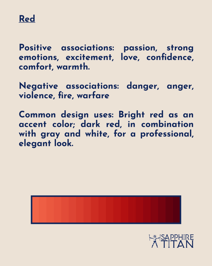
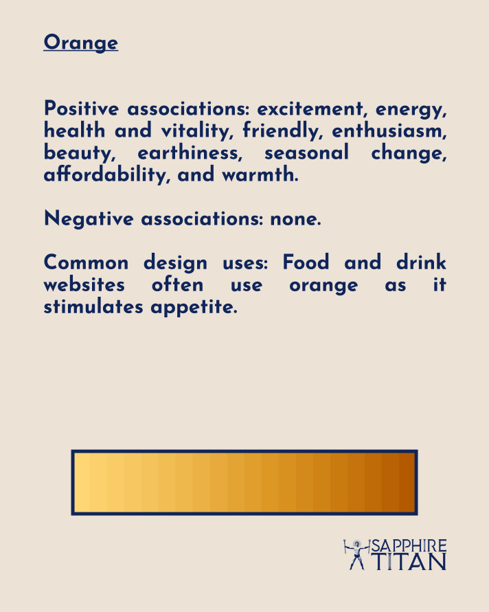
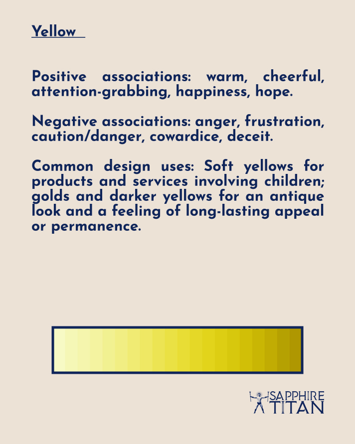
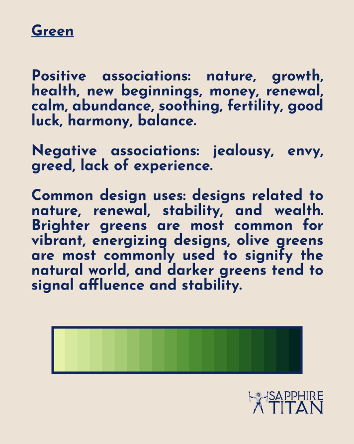
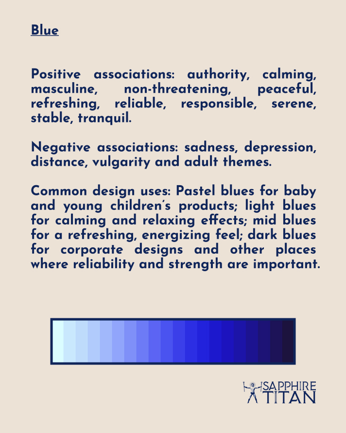
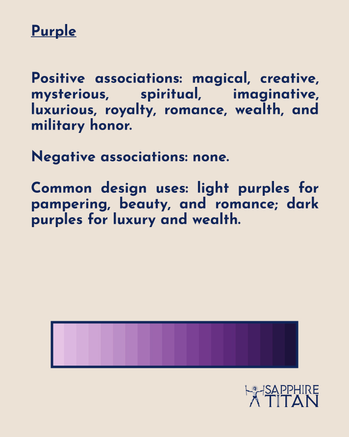
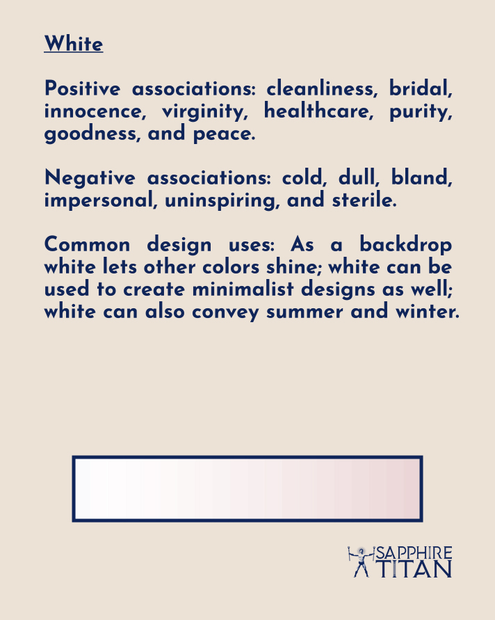
Take a closer look at the characteristics of each colour and how they apply to design.
As you can see, choosing colour is about more than making something look appealing. Every business employs deliberate uses of colour in their product designs and/or visual branding.
For example, fast food restaurants are designed for their customers to order their food, eat it and leave within a half an hour window. This is done by using bright, usually warm colours and harsh lighting for their interiors to discourage people from loitering. Alternatively, restaurants and bars generally use tranquil, cool colours to encourage customers to stay and spend money buying additional refreshments.
Quality graphic design relies in part on the ability to select colours that work with the brand and the company’s mission. The psychology of colour can and must be used to trigger the right responses from consumers, and this is part of the graphic designer’s goal.