Why? Here are two reasons.
The first reason for this is because light is a spectrum of all the colours you see in rainbows and many more that the human eye is unable to perceive. So, what we call “colour” (or color if you’re American) is actually an aspect of that spectrum reflecting off of a surface while the rest is being absorbed. Therefore, when you see black, all of the light is being absorbed and when you see white, all of the light is being reflected. But the world we live in isn’t just black and white.
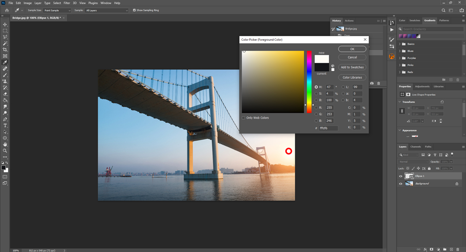
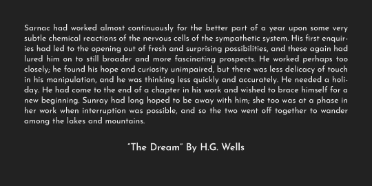
As you can see in the above and below screenshots, the brightest part of the photo isn’t pure white and the darkest part of the photo isn’t pure black. Which brings us to the second reason why you shouldn’t use pure black or white and definitely not together.
While good design involves using colours with the highest contrast possible, the use of 100% of the spectrum or 0% overstimulates the retina. This goes double when you put them together. The overly high contrast makes the eyes work harder to adjust, which eventually leads to strain. See for yourself with the excerpts below

So, what’s the solution?
Simple. Instead of black and white, use dark grey and light grey. Doing so makes the excerpts below so much easier to read.