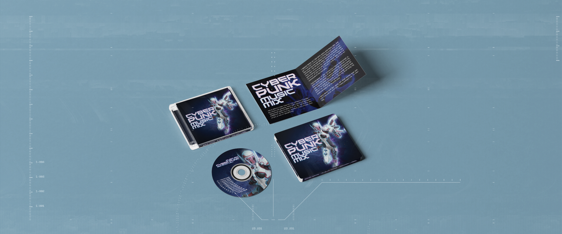
A visual hierarchy is the order of importance the aspects of your design have. One way to help determine that is the language of your main audience and which direction it reads when written out.
For instance English, along with all European languages, reads from left to right, then top to bottom. In fact most languages do so.

However, bear in mind that some highly spoken languages don’t. Most linguistic scripts from the Semitic language family such as Arabic and Hebrew read from right to left. As do any languages that have adopted such scripts like Persian and Urdu. Also, some languages in East Asia read from top to bottom then left to right.


Once you have determined the direction, you then determine the order of size. Naturally, the most important aspect needs to be the biggest. It is worth noting that when reading text or looking at shapes, size trumps reading order. This means that you don’t have to place the most important aspect of your design at the top left in order to be noticed first. However, if you place it too far away from that point it can confuse the reader.
 |  |

