How to style your Blank Release Kit
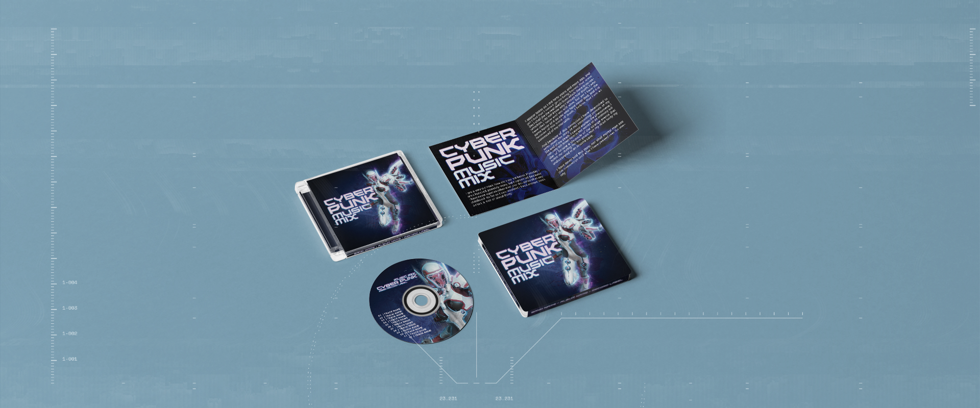
Looking for some ideas on how to use your Blank Music Release kit? If you don’t have a Blank Music Release Kit, head over to …
Looking for some ideas on how to use your Blank Music Release kit? If you don’t have a Blank Music Release Kit, head over to …
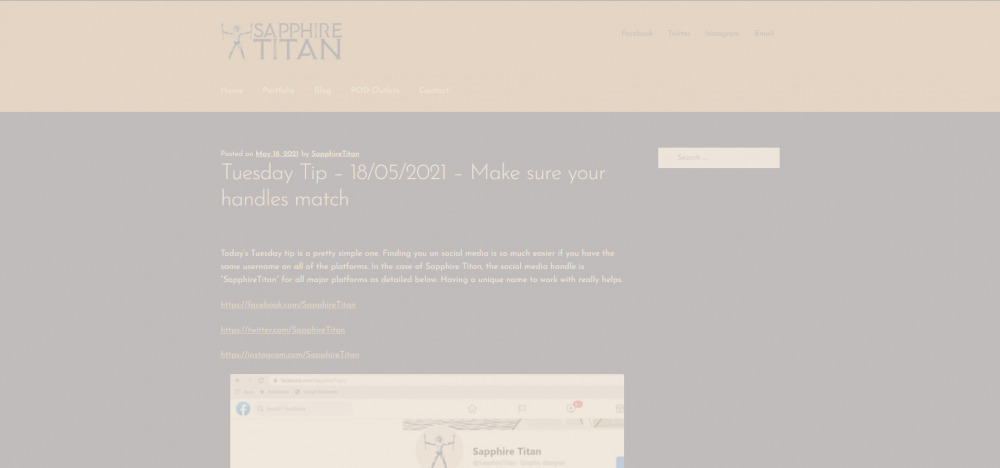
Today’s Tuesday tip is a pretty simple one. Finding you on social media is so much easier if you have the same username on all …
The picture uses several layers to separate the foreground, middle ground and background. To create the illusion of distance, some fog/mist was drawn on a …
Proper alignment is an easy way to give your designs structure and order. Without it, the design is at risk of looking cluttered, disorganised and …
A visual hierarchy is the order of importance the aspects of your design have. One way to help determine that is the language of your …
Never use more than three fonts in a design. In fact, stick to two if you can. As most font families have a regular, bold …
Why? Here are two reasons. The first reason for this is because light is a spectrum of all the colours you see in rainbows and …